Category Archives: Uncategorized

La Gruta Azul at Jancar Gallery

Richard Newton was the featured artist at one of Chinatown’s art galleries, Jancar Gallery. A total of 9 pieces were showcased, with Newton’s “La Gruta Azul” installation as the centerpiece of it all. When I first entered the gallery, I thought I had stepped into the wrong building. My face was greeted by floor to ceiling strings of empty aluminum cans and plastic water bottles in every direction. Newton creates a maze of cans on strings through which you can walk through and enter a cave-like center area completely made of bright blue Pepsi and beer cans. In the center of this space is an open keg of “holy water” glowing neon blue with more glass bottles floating at the top. The floor is also covered with crushed blue cans and visitors are encouraged to kick the cans around because according to Newton, the noise is part of the experience of the installation. I loved this installation; there were so many different elements and small details to discover that one could spend hours walking through the walls of cans. The light shining through the front window also created a dramatic effect when reflected off the shiny cans, however I’m not sure if that was the intended idea.

Walking into this installation made me feel like I was in a vibrant yet calm and soothing, man-made world. The blue lights plus the rush of water provided the peaceful backdrop for exploring this new “world.” To me, it was a peek into the future, where eventually everything created be made from previously recycled products. On the walls of the installation were several molds of Jesus surrounded by broken glass shards. It might have been an analogy to how much society worships products and the convenience of them.

Newton incorporates cans into his two-dimensional work as well. “Lost and Found in the Ozone” is a photograph of flattened tin cans with various aerosol cans attached to the aluminum canvas. Through this piece, it seems the viewer actually realizes the reality of harming the ozone through the overuse of these products. It depicts the overuse and prevalence of cans. It also shows that very old metal does not simply disintegrate; it remains intact for decades.
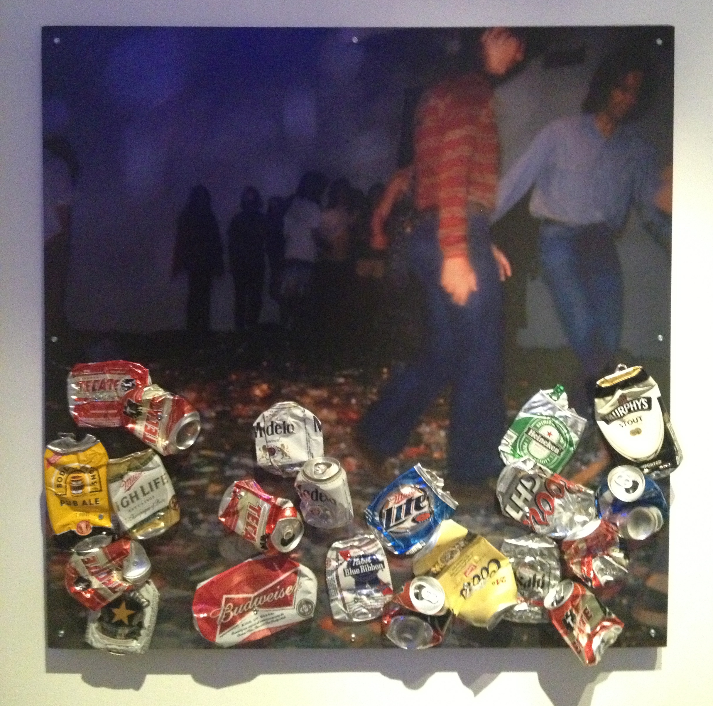
Ricardo’s Original CANTINA” was another photograph printed on aluminum with additional crushed beer cans attached to the surface.  The photograph was of young groups of people interacting with one of his previous installations, “CANTINA.” When placed in a setting with only recyclable trash as the focus, people surprisingly become very entertained. I think Newton is trying to gather a higher human emotion or response from something that is so ordinary that it is usually considered trash. The people in this photo look like they are enjoying themselves while they kick around the empty cans. By using cans as his only material, it seems that he wanted his viewers to get back to basics in life by forcing them to focus on just one simple ordinary object. Yet, in all of his works he seemed successful in turning trash into an intriguing material.

"La Gruta Azul"

“La Gruta Azul”

IMG_4354

Review on Jay DeFeo

By: Katy Durbin

Jay DeFeo’s The Jewel is a graceful reminder that paint does not always denote a two-dimensional surface. Rather, it challenges the constraints of the canvas, as well as the physicality of the paint itself. It is often easy to assume that paint is meant to color, that paint is a means of conveying color, rather than physicality and substance. Yet, when one observes the cracked surface and elevated masses that make up DeFeo’s massive, six foot gem, it is impossible to separate the beauty of the image from the grotesqueness of the clumped and dried paint. On closer inspection, the paint, which is superficially white yet gains scarlet red and rusty brown qualities lower down, begins to resemble an opened wound, a mass of torn flesh. One can easily connect this appearance with the savage slashes the artist probably created with a palate knife, so as to cut through the partially-dried layers, exposing oozing oils underneath.

The image is a complete irony, as the viewer, on first glance, is led to believe that this is only a beautiful object. The image, when viewed from afar, is of a white star, a religious radiance that conjures thoughts of heavenly images and the iconic “white light”. Yet the piece is almost festering; it is in a state of decay. The clotted, rust-red paint eerily mimics flesh, contrasting the smooth, white skin that remains unbroken in certain areas. The sacred object is an object of degradation. The actions taken to construct such a structural object, only to break it open, almost seems like an act of defilement. Yet the image would be incomplete and uninteresting without this action; the paint would not reveal its materiality.

Jay Defeo’s works are generally architecture, and draw influence from the concept of structure. Of her other works at LACMA, two are works of photography and one is a graphite drawing. Defeo experiments with the idea of broken objects and images, utilizing common materials to create simple ideas, which she then breaks down, showing the materiality of the substances. In one untitled work, DeFeo photographs a sculpture of herself, crossing mediums by reducing a three-dimensional object to a two-dimensional format.The Jewel conveys this same idea, though by reversing it, using paint and canvas as sculptural elements. This novel approach to painting made the work stand out from other pieces, and gave the oil medium a new layer of complexity.

pastedGraphic.pdf

Irene Hardwicke Olivieri at Bergamot Stations, Robert Berman Gallery

When visiting the Robert Berman Gallery, located in Santa Monica’s Bergamot Station, I came across an exhibit that not only caught my attention, but truly enveloped my mind, making me eager to see more. I had merely skimmed the local exhibitions trying to locate one that looked interesting, unaware that I would be so taken back by the work in person. According to her Bio, Irene Hardwicke Olivieri is an American artist, born in Texas. She grew up with her family, who operated a farm near the Rio Grande. She then moved to Brazil and lived in Rio de Janeiro. From there she traveled through South America, returning to Texas and Mexico to study art. I feel the need to specify where she lived and traveled due to the content of her artwork. Without this background information her work does not appear as personal, versus aesthetically pleasing. Her background confirms this connection that she has with a more spiritual, cultural, and natural mindset.

Within the Robert Berman exhibit entitled, “Breakfast in the Forest” many different forms of her work are displayed on materials such as wood, copper, antiques, and other metals. She creatively displays busily composed images on antique pieces of wood and other surfaces that really enrich the earthy qualities within the content provided. The images are heavily based on the female body, generally in a nude state, with many unnatural alterations among the skin coloring and proportioning. She displays women morphing into animals, trees, bodies of water, and other natural elements. Plant vegetation grows off of and within the skin of her figures, while being juxtaposed with organic and detailed script. All of which blend together harmoniously, to create active environments that encompass emotions such as venerability, love, jealousy, and temptation. This bold mixture portrays aspects of life through a naturalistic filter of not only woman, but animals as well, in relation to the human. get-attachment.aspx

get-attachment.aspx

Screen shot 2013-09-23 at 10.41.52 PM
Another large portion of the show are her “Paleo Girls,” which are arrangements of rat and other rodent bones, excavated from owl pellets. Irene collects these pellets and dissects them in order to create these figurative images of the woman, place upon wooden and copper surfaces. From a far they look like they could be paintings as the bones are so small, and as you become closer to the work you realize what they are. This creates a fascinating mixture of beauty and grotesque aspects of death. This contradiction suits the images well, as humans do have bones within them, just like rodents and other animals.

Her art appears to be reflective of her inner self and the way she see’s the world. From my viewpoint it appears that this artist is very in touch with the aspects of the universe, in contrast with spirituality and interconnectivity of nature and human beings. Her work provides a strong message to me, enforcing the belief that we are all one within the universe. Humans, animals, and nature are beautifully articulated portions of ‘life,’ that should be celebrated and loved by one another. Her work creates a feeling of eternal joy and love, regardless of the traces of demon like figures and reminders of death. The message of worldly love and appreciation comes through her work much stronger, overcoming such demons that we all face. I personally loved seeing her work in person in contrast to viewing it online previous to my visit. The presence they withhold in a space is truly wonderful and unlike many other painters work. I am unsure weather it is the use in different surface materials that intrigues me the most, or the incredibly developed compositions, filled with mysterious symbols and hectically portrayed life. Overall I think her work is extremely unique and beautiful in more ways then one.

-Valerie Schub

Thinkspace Gallery – Matt Doust

I visited Thinkspace Gallery in Culver City to see Matt Doust’s painting exhibition. Matt Doust tragically passed away just a few weeks ago while he was preparing for the show from an epileptic seizure, which made seeing his work all the more powerful, as well as sad. Doust’s show, appropriately titled “Final Works,” was an exhibition of mostly large scale, larger-than-life portraits in oil paint, in addition to a few smaller graphite portrait drawings. These paintings were all close-up portraits of women’s faces, from the shoulders up, with the exception of one piece depicting both a woman and a man. All of the pieces are painted stylistically the same, with hyper-real precision and extremely smooth texture. The backgrounds each consist of a single velvet-smooth, neutral color, ranging from charcoal, to mid-tones, to off-white.

Doust clearly had a very specific, intentional way of painting these portraits in order to convey questions of identity, interlaced with feelings of alienation and intimacy, through his work. The extremely enlarged size of these faces makes them tower over the viewer, creating a distance between the two and making the portraits seem somewhat unreal. The velvety backgrounds serve to create these alternate spaces which are neither reality nor fantasy, but act as literally and figuratively neutral grounds on which each person’s expression seems free to take over. At the same time, the extreme level of precision and detail, combined with the softness of the texture of the paint, makes these faces appear as though you could feel their skin if you touched them. The extreme level of realism, almost hyper-realism, in these large scales creates a sense of intimacy with the figures, particularly the ones which are gazing directly at you. The result of this juxtaposition of alienation and intimacy is a jarring discomfort. The viewer is made to feel like they can almost look past the surface of the paint and see who these women really are, but in the end there is a sadness that is expressed in the eyes of the figures and in the minds of the viewers as a result of the insurmountable distance between them.

I personally was completely amazed by these portraits. The sheer size and the quality of the paint is somewhat mesmerizing. I also immediately felt the level of discomfort and apprehension I think I was intended to feel, before I realized why I was feeling it. I felt as though I was seeing in to private rooms and each time was being caught by the person I was watching. While his pieces are all incredibly similar and work perfectly together as a group, I also found them each to be unique and intriguing in their own ways individually. He clearly had a gift for capturing the essence of the person he was portraying, as each one feels to me to have a different personality, whether it be because of the pose, the attire, or the facial expression. Each one is beautifully done, and, in my opinion, highly successful.

Oil on canvas 36x48"

Oil on canvas
36×48″

-Erin O’Brien

Pinaree Sanpitak’s “Hanging by a Thread” at LACMA

         I went to LACMA last week for my gallery visit and there were lots of interesting exhibitions going on.  I visited almost every exhibition in LACMA, but the most impressing and interesting work was Pinaree Sanpitak’s installation work, “Hanging by a Thread.”  Even though it is not a painting work, her installation inspired me a lot in many ways.

ImageImage 

        Pinaree Sanpitak is an artist working in Southeast Asia.  She is known as one of the most compelling and respected Thai artists of her generation, and she is now having an exhibition called “Hanging by a Thread” at LACMA.  The title of this exhibition, “Hanging by a Thread” refers to the artist’s response to the recent flooding in Bangkok, where she lives and works.  This installation work is made by many different kinds of traditional Thai printed fabrics known as “paa-lai”, and those fabrics are actually used to make relief bags during the natural disaster in Thailand.  The hammocks, made from this fabric, are hanging from the gallery’s ceiling.  She tried to represents a comfort, refuge, and contemplation with her work.

         For me, it was the first time to see her work.  When I first got into the exhibition room and saw her work, I felt holiness and calmness because of its gently curved line of fabrics and male sculpture in the middle.  At first, it looked like ancient statue, but it also gives me a Southeast Asian feeling a lot.  The beautiful traditional Thai fabrics were fascinating to me and it catches my eyes and mind.  I love its detail of texture and small patterns on each hammock.  It gives me a fantastic feeling of Southeast Asian world, and the harmony of unusual shapes, decorative colors, and woman sculpture creates the Asian beauty.

– Jiwon Kim 

Matt Doust at Thinkspace Gallery

I visited Thinkspace Gallery to see the work of Matt Doust, who unfortunately passed away before the opening of his first solo U.S. exhibition now named “Final Works.” Doust is a hyperrealistic painter and his final paintings on display were just that, a range of hyperrealistic oil portraits. His subjects are primarily female although in this show, he does include a portrait of a man and one of a woman and a man together. There are also several graphite drawings on paper. The largest painting in this show, one of my favorites, measures 60 x 72 inches tall. I liked the direct eye contact between the subject and the viewer. Untitled #2 is striking as well, featuring a woman in a headscarf with her breasts exposed. The implications of that painting are quite loaded. You can see both below.

photo (10)

photo (8)

I would recommend seeing this show for the technical aspects of painting. Doust is definitely a skilled painter. His paintings do not feature dramatic lighting and you can really see how he pays attention to the subtleties of light hitting the skin. His subjects are carefully examined, revealed by the details of freckles strewn across bodies, eye lashes, wrinkled lips, and etc. They are also really reminiscent of fashion photography. In fact, he gained attention in 2011 for painting fashion model Gemma Ward.

The size of the canvases makes his work quite confrontational as the viewer has no choice but to come face to face with giant faces. Expressions of the subjects are rather subtle but direct eye contact with some of them reveals a voyeuristic relationship between the artist, the viewer, and the model.

Something to be noted was the painting on an easel in the gallery. It appeared unfinished and was surrounded by a crowed workspace. In an otherwise orderly gallery, the clutter not only makes it personal but also acts as an altar to the artist.

The show will be up until September 28, 2013.

– Kelly Guan

By Dani Egna

For my gallery visit, I went to Galerie Michael in Beverly Hills. I was extremely surprised at how large and impressive the space was, and I don’t think I’ve seen so many Picasso’s in one place in my life! While walking through, a particular wall caught my attention. It was filled with huge, bright paintings in grand gold frames. The one in particular that I liked the most is Butterfly Branch by Alexandre Renoir. The oil painting was made in 2013 and is 30 x 40 inches. The painting is of 2 butterflies with branches and flowers.
My analysis of the painting will start with the way in which it was displayed in the gallery. It was surrounded by very similar paintings which created an overall giant wall display of nature themed paintings. The one I chose to talk about is the center one, and the biggest one. The way these were set up lend to the feel of the painting and by grouping it with similar ones makes the overall display more grand. Also, the way in which it was painted brings it to life. The paint is so incredibly thick it comes out about half an inch at some parts. This brings such movement to the painting because you feel like it is three-dimensional and it’s coming out at you. The globs of paint are extremely expressive and add to the organic, unstructured feel of the painting. I think the artist painted this to show how the physical thickness of paint can evoke emotion and create a sense of movement.
I love this painting and spent quite awhile looking from all angles to see the thickness of the paint. This style of painting makes it more interesting to be able to see the actual brushstroke of the artist. It seemed to me that each petal of paint had about half a tube of paint on it. It really inspired me to paint thicker. I loved the look of this and was curious about if he painted with a brush, or maybe laid it down with a palette knife. Even though I usually don’t paint with bright colors, it seems that bright paintings are the ones that always catch my eye. Hopefully I can add more color into my future paintings.
photo (18)

Curtis Hoekzema at First Independent Gallery at Bergamot Station

Curtis Hoekzema’s “Recent Work” Exhibit is currently at the First Independent Gallery at Bergamot Station! It closes in the next few days, October 5th, to be exact, and is definitely a worthwhile exhibit to check out! The gallery itself is divided into two distinct rooms, which plays out quite well with the nature of Hoekzema’s work. Hoekzema’s paintings are definitely more confined paintings in that the scenes exist entirely on the dimensions of the paper, but upon entering the painting you dive into a deep space. This is reflective in the gallery setup, which opens up with a larger rectangular room and ends with two smaller rooms further back. There is this feeling of confinement and delineation of space width and height wise, but expands in depth.2010, acrylic on paper, 67x38”

Hoekzema’s pieces are all characterized by a high amount of contrast and a distinctive graphic style, which he notes stems from an innate desire for definition. Hoekzema has been heavily influenced by Japanese graphics, Pop Art, Asian Ink paintings, and California watercolors. In his piece Jumper, we clearly see the influence of Japanese and Chinese art interacting with the boldness of Pop Art in the image of the child reaching his hands out from what looks like high chair. He works a lot with acrylics on paper, and notes a sense of freedom experienced with such media, as he can easily extend the dimensions of his work. Throughout all of Hoekzema’s paintings, depth is strangely created by extreme flatness of his shapes and shadows.

acrylic on paper, 2013, 76x58”

Jumper, acrylic on paper, 2013, 76×58”

In this exhibit, Hoekzema’s work has generally been inspired by the experiences he recalls and sorts out, as is evident in the narrative nature of his pieces. In discussing his exhibit, he notes that “when on giving oneself over to the aesthetic emotion there can be a kind of washing away of distractions, delusions, the limitations of time and space, the distinctions between ‘you’ and ‘it’, a sense of an opening up toward something better, maybe even toward something great.” His explicit efforts to put away those distinctions and limitations is fascinating in that when doing so, he actually uses figures and shapes that take delineations, limitations, distinctions to the extreme in that there is virtually no blending or smearing of edges, etc. In all the flatness and basic shapes, Hoekzema creates very interesting spaces in which his pieces can seem to be an amalgamation of one image from different perspectives. For instance, in his painting Jumper, it appears as if we were viewing the baby in his high chair from above, but the metal bars along the edges open in a way that it looks like we are observing the baby at eye level, and yet when we look at the toys dangling above the child, it appears that we are looking at them from an only slightly elevated position.

2013, acrylic on paper, 80x38”

Naiad, 2013, acrylic on paper, 80×38”

My personal favorite would have to be Naiad as I am struck by the power of the white line figure against the dark foreground, begging the question of ethnicity and race. Moreover, the figures posture, which boldly faces the viewer straight on, is in striking contrast to her bowed head, which suggests a much humbler stance. The white wavy lines extending from the figure suggest a river, which also mimics the green wavy lines that evoke an image of vast fields despite the limited patch of green in the left corner. What really strikes me is Hoekzema’s ability to create such incredible depths and space using such flat drawings. In Naiad, the bamboo looking shoots, which again beg the question of the figure’s cultural background, appear so flat and yet you clearly understand that this scene spans far back. It is truly amazing to me how the figures and images in Hoekzema’s paintings are individually rather confined, clearly delineated, and yet they stimulate the mind to fill in the rest and extend lines and shapes to continue building that narrative. I really enjoyed that his paintings in a sense toy with your mind; as you look at something so simplistic, almost juvenile, you also jump into a narrative, putting your own story into his work, complicating it, crowding it, and adding more and more layers to all his flat, curvy, jagged lines, geometric shapes, and dots.

~Kristen Chen

Asher Penn at Maloney Fine Art

Asher Penn’s Kate Moss Rorshach series. Three photographs of Kate Moss of different, interchanging monochrome prints with Rorshach-esque blots of paint. The pieces were about poster size, approximately 24”x36.” Their palettes consisted of saturated primary colors. Kate Moss’s face is partially obscured behind parts of the Rorshach prints. Her eyes pierce through the paint. Lustful. The prints start to look like genitalia. Visceral, carnal. Innuendo.

IMG_1055

The color palette and creation process of very reminiscent and/or alluding to the pop art movement and Andy Warhol. Strong bold colors. Prints. Then, of course, there is the subject matter—a sex icon of American popular culture. Marilyn Monroe. Kate Moss. Both are blonde. Both epitomized sexuality in their own decade. Blonde Bombshell. Heroin Chic.

IMG_1054

But, then to address the Rorshach blots. Psychology. Rorshach blots have become synonymous with psychology. Rorshach blot studies have been discredited. Yet, they are now a mere a simulacra of what they once represented. Access to your inner most thoughts. Free association. Freud. Freud theorized about free association, but also about sexuality. The libido. The Id.

IMG_1056

The combination of these elements creates a conversation about popular culture and its influence on us. Additionally it comments on the sexuality of popular culture and how that influences us.  By referencing pop art, the series also represents American culture. What do these values of American culture say about our identities as Americans?

In terms of my own art, I found this series particularly interesting because of the layering and what the juxtaposition of the images create. The Rorshach blots were used for free association of the mind. By layering the blots on top of such sexually charged images, the blots began to take on sexual shapes. That relationship could be interesting to allow it to inform my work. Also I like the idea of combining psychology and psychological imagery as layers in some of my future paintings.


Elizabeth Sanders

René Magritte at LACMA

Magritte has always been a favorite of mine and an influence on my artistic process. LACMA displays two of his pieces, “The Liberator” and “The Listening Room.” Regrettably, the exhibit does not cover a comprehensive enough range of his work. I found these two paintings particularly interesting. Both showcase Magritte’s characteristic core style and technique. I think it would be intriguing to view an entire exhibit of Magritte’s work and discover the connections between each one. Already in these two paintings we see common themes of snippets of idyllic landscape and smooth renderings of tone. His deliberate distortion of reality in a very frank way makes the audience feel like the inner workings of his psyche are exposed on the canvas. These two paintings also express a similar presentation of the main figure, which is compositionally centered and feels “larger than life.” The figures, though they have a dominant presence in the paintings, do not appear confrontational but rather seem to welcome us into the world they have occupied as their own. The shading of the man and the apple could have been pushed further, but it is the quiet effect that it has that gives the figures their alluring character.

Image


The Listening Room (La chambre d’ecoute), 1952

Oil on Canvas

What drew me to “The Listening Room” was the sickly green color of the apple that we see clearly splotched onto where the light reflects. This color choice was quite unappetizing to me, but I like how it transformed the apple into less of a food item and more of a strange creature. Expanding a typically small apple within a small canvas successfully produced the desired effect of massiveness and fullness as well. Although about 85% of the canvas is filled by the apple, I did not sense too much of a feeling of claustrophobia. The insertion of the window on the left was enough to open the space, so the room feels more contemplative than imprisoned. While I do enjoy the visual effect of this piece, I think I would have much more insight into its meaning and other implications if I was able to see the entire series of “Listening Room” works, which Magritte had apparently completed.

Image

The Liberator, 1947

Oil on Canvas

“The Liberator” is a fascinating piece. One could interpret this painting to be rife with symbolism, while another may see it as a jumble of meaningless shapes and object. Every element of this piece has a certain strangeness to it, which really invited my imagination to run wild. The apple painting made me ponder what statement Magritte was trying to make, but I think this painting can evolve into something especially personal that does not have to be connected to the artist’s intention at all. The apple and man both have a very tangible presence nonetheless in addition to similar style, but it’s interesting how they evoke such diverging paths of feeling and thoughts.


-Jessica Huang